Jun 3 2015
Branch “styling”
I have added a temporary project branch styling on GitHub WebLaF project page – almost all new changes are added there right now. This branch contains changes required to enable styling support for all existing components. It isn’t stable right now and might even be uncompilable sometimes, but as soon as I finish adding modifications it will be merged into the master branch and I will finally be able to release v1.29 update.
I was going to postpone a lot of those changes and release only small chunks one by one but that would force me to add even more workarounds for older parts of the code. So I have finally decided to finish it in one sweep. Originally this was the goal of v1.40 release, but it is coming sooner than expected. Some improvements will still be made on the way to v1.40 release, but the main part will be added in v1.29 update and it won’t be a simple preview – it will be fully working styling system.
So let me go into some specifics of changed you can expect…
Web- components and UIs do not provide bridge methods anymore
All style-related methods like panel.setRound(…) or button.setShadeWidth(…) are now gone. All the settings are now provided through XML as a skin description.
Of course those settings aren’t gone – they are now provided through the XML-based skins into component painters. That might add some minor constraints, but in the end it simplifies applications code by separating styling from the UI composition and actual application logic. Also a lot of new features are built on top of that simplification which will fill-in the gaps, so don’t worry – you will have all of the options you had before in some form.
Another reason why I got rid of them is that these methods took more than a half of development time just to be added and supported. No more. It was a bad design decision to add them in the first place and I will avoid this mistake in future. I really want to bring new awesome features and improvements to WebLaF instead of being stuck on supporting clunky code.
Let’s look at a simple example – re-styled button. This is how you might have done that with older WebLaF versions:
Pretty straightforward, but… so messy – all the style settings for this button are now hardcoded. To have multiple copies of this button with the same style you would have to invent some ways to apply it quickly without hardcoding for each separate button. Now here is the new way of handling components style: (keep in mind that it is still WIP and might change until release)
As you can see – component now receives appropriate style from the XML skin file which can be easily modified. Style ID field points at correct styling for this component in the currently installed through StyleManager skin.
Advanced styling is now supported by all WebLaF components
Starting with WebLaF v1.29 release any Swing component and any of its parts will be re-styleable using the customizable skins. You will even be able to use multiply skins in single application at the same time!
Each skin is a combination of its XML description file(s) and painter classes for specified components. When skin is applied to some specific component it forces it to use painters and settings provided in XML along with the skin.
Why XML you might ask? I had a few reasons to choose it instead of other possible options. First of all – it is a well-structured format that allows you to build your own data the way you want it to be – this is exactly what I needed to create a simple and readable (without any additional tools) but yet powerful styling format. Second reason is that there are many good and polished tools like XStream (which already takes part in some WebLaF features) to work XML in Java unlike other formats (like CSS). And the third reason is that I wanted styles to be easily convertable into Java objects representation and back again which can be easily achieved with XStream.
New skins can be easily created by providing XML resource location into CustomSkin class. In the XML you are free to define any styles you like for any components. But keep in mind that you might want to define styles for all components you will be using in your application, otherwise they will not have any style to use and will be displayed completely blank. For a quick start you might want to include default WebLaF skin as a base for your own one as it already contains styling for all components – that way you can easily replace any styles you want to modify and leave the rest of them as they are. I will be providing detailed guides on how that can be done along with the v1.29 release.
Creating skins on-fly
Even though XML is a base form for all skin settings, those can also be created explicitly in the code without specifying any additional resources. Skin XML settings are simply a way to store style settings separately like CSS for HTML. So instead of using XML description of the style you can define the whole skin in pure Java code.
This might be handy if you are not up to working with XML and would prefer defining your application style in runtime. You might even create your own way to read style settings from some other style format like CSS.
Detailed guide on how skins can be created and modified will also be available along with the release of v1.29 update.
Much more settings for each component
Until now each component painting code was attached to the component-specific UI. That forced me to provide all style-related settings into each UI even though a lot of them might be the same between different components (like the decoration round or shadeWidth). Upcoming changes will remove these constraints – all components painting will now be performed in their painters which are almost fully separated from UIs and give much more development freedom.
As an example, a lot of component painters will now extend WebDecorationPainter which paints base WebLaF components decoration and contains all visual settings like round, shadeWidth or borderColor. So if I would want to add some new visual feature to decoration or fix a glitch in it – it will be enough to modify just that class. Similar approach is now also taken to paint some components which had the same or almost the same view like JTextField and JPasswordField.
Unified margin and padding
In previous versions of WebLaF I have widely used margin and have provided it as an option in almost all of the basic components. It was some kind of a replacement for spacing between content and border… at least usually. Not too convenient, right? For example for JButton margin was used as an additional spacing between decoration and button content (icon and text).
Now you will have two options in almost each component – margin and padding. In some components padding is not applicable so it is simply not supported there. They will act similarly to CSS margin and padding – margin will always provide spacing between component styling and its bounds, padding will always provide spacing between component styling and component content which is basically what old margin was used. You will be able to provide these settings directly into Web- component, Web- UIs or specify them in skin XML file.
Grouping UI elements with GroupPane
In earlier versions of WebLaF I have introduced WebButtonGroup which allowed you to group buttons visually. Though it couldn’t group other elements like panels, comboboxes or textfields and that was a strict limitation I was not able to overcome. Until now.
On top of that – it had a few flaws which were sometimes forcing you to create a messy code. For example you had to re-style buttons in a group to have the same shade width, border and few other settings which can actually be automatically performed by grouping component itself.
Next update will feature new component to group any UI elements with partial decoration support – GroupPane. There are many components that support partial decoration – panels, buttons, textfields, spinners etc. You will be able to group those visually (both vertically and horizontally) by simply adding them in a GroupPane – a grid-like container that handles components visual settings. You will also be able to control that container side-decoration so that group of elements can be easily integrated into any possible UI part.
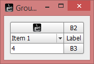
Here is an example of a few elements placed into 2×3 GroupPane:
GroupPane automatically adjusts components decorations to make them even and groups them visually using PartialDecoration interface methods supported by component painters. It also tracks skin, orientation and enabled state changes to update styling accordingly.
New StyleEditor tool
Last but not least – there will be a new tool available for creating new skins and editing them – StyleEditor. This tool was in the sources for a long time, but it was not finished due to required changes. It will now get some love and it should be really handy in creating new skins or tweaking existing ones.
Using that tool you will even be able to change style in your live application! Simply launch StyleEditor from your own application, edit the skin and instantly see the results on your application UI.
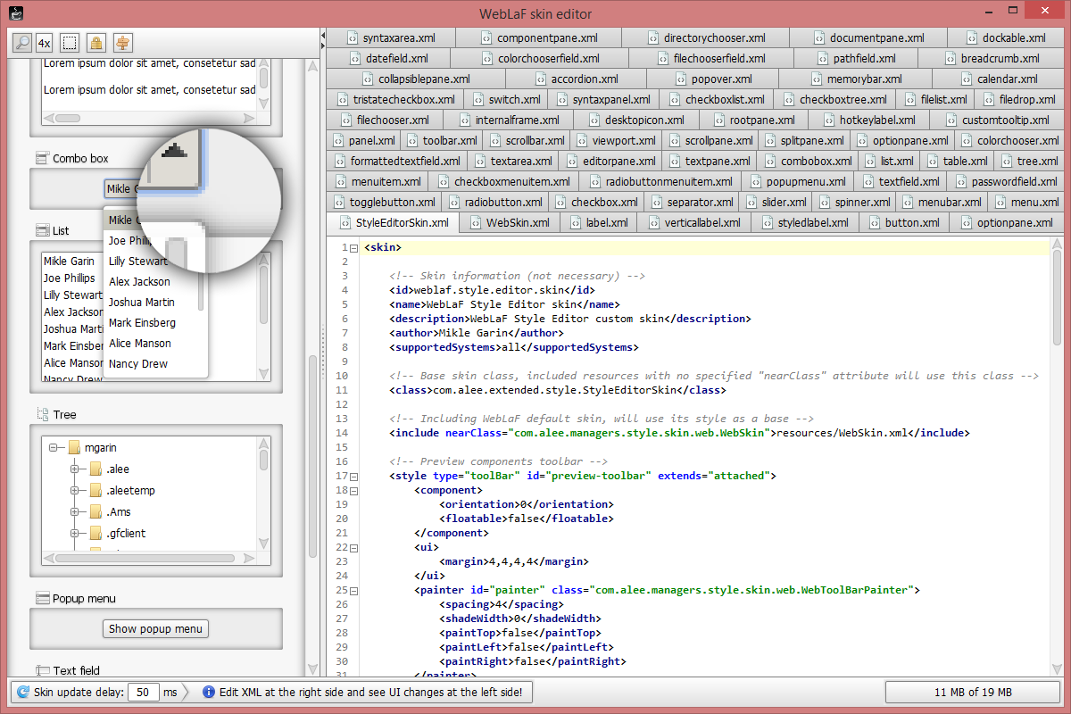
Here is a screenshot of it from the current styling branch revision:
I still haven’t modified its UI and some things are missing or broken, but it is already helped me a lot in creating new styles and tracking down issues. I am sure that it will be a useful tool for everyone who wants to alter their application skins.
Summary
This is long-awaited update for the complete styling support I have announced before. It will be going live pretty soon with a lots of changes and improvements to all important aspects of WebLaF some of which I haven’t mentioned in this post as they aren’t yet ready or might be changed.
And yes, it breaks a lot of component APIs which were provided for a long time now, but it is a necessary change to refresh the code and allow me to bring much more features and improvements in future in a shorter amount of time. All component features will still be supported, but in a slightly different form.
It is also one of the biggest updates made to WebLaF since its initial release so I will be adding much more information and detailed guides on each specific feature separately on wiki and on the official WebLaF site as soon as it is released, so stay tuned!


Sep 04, 2015 @ 06:23:06
Great news. hopefully we will see it soon
I believe it might be good to refresh the icon set to the web style. it becomes more and more popular now in PC application (e.g. windows 10, office … etc) the same as in Android iOS.
example is from google:
https://www.google.com/design/icons/
Sep 04, 2015 @ 11:00:12
I’m not really a big fan of the new over-simplified design styles – it might work well for some mobile/web application, but I don’t think that it fits nicely into desktop applications. But in any case – you will be able to change the whole icon set WebLaF uses, so this should not be an issue later on in case you don’t like the current icon set.
And yes, I am working hard to bring the final release 🙂
Aug 25, 2015 @ 10:11:12
Awesome work man, good job.
Aug 07, 2015 @ 18:03:31
awesome thank you.
Jun 04, 2015 @ 19:48:01
Amazing news, keep up the good work!
Jun 05, 2015 @ 03:23:44
Thanks 🙂